Your execution logs tell you what happened. We tell you why.
One-time diagnostic powered by a proprietary engine built over years of R&D on production trading systems. Every result is deterministic and auditable. Not AI-generated. Not a template.
Currently onboarding a handful of firms through a free pilot program. Limited slots, hand-picked by fit.
Apply for a Pilot Slot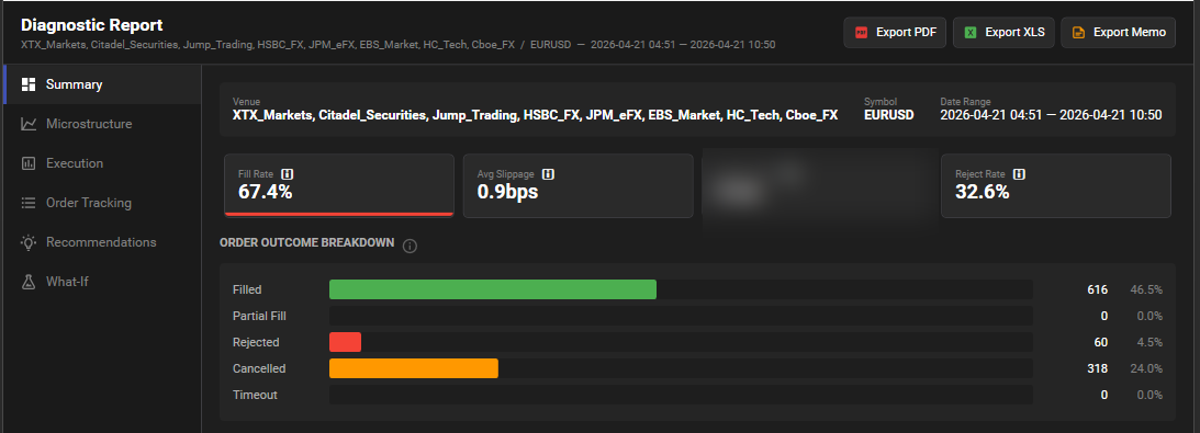
The Summary dashboard is page one. Fill rate, slippage, reject rate, and order outcome breakdown for every venue in scope — before you click anything.
What You Get
Built by engineers, not generated by AI. Every analysis is the product of years of R&D on live trading infrastructure.
Proprietary Engine
35+ analyses running simultaneously through a pipeline built over years of R&D on production trading systems. Every output is deterministic and auditable. Not AI-generated. Purpose-built tools, calibrated by engineers who have operated these systems.
Diagnostic Report
10-15 page PDF across 5 sections: Summary Dashboard, Microstructure Context, Execution Analysis, Recommendations, and a gray-box Methods Appendix. Accompanied by a 7-sheet XLS workbook with the raw data behind every finding.
Execution Health Dashboard
Fill rate, slippage, latency, reject rate, toxicity, and book imbalance at a glance. Color-coded. The first page of the report tells you where to look.
Top-3 Changes Memo
Two pages. Three findings ranked by dollar impact. Root cause, evidence, and a 30-day action plan for each. Deterministic results you can put in front of a board.
Actionable Recommendations
Specific thresholds you can implement: where to cap order sizes, when to back off on rate limits, which venues to prefer under stress, which size bands fill on first pass. Derived from your data, not from a textbook.
How It Works
Three steps. Three to five days. One complete picture.
Discovery
We learn about your operation, agree on scope, confirm your data format.
Analysis
Your data runs through the engine. Every finding is interpreted against real-world trading infrastructure context by our lead consultant.
Walkthrough
Full report delivered and reviewed live. You leave with quantified recommendations.
Who This Is For
The diagnostic adapts to your trading profile. Every engagement is scoped to what actually matters for how you trade.
Multi-Venue Market Makers
You quote across multiple venues and asset classes. Cross-venue integrity and arb gaps matter more than raw speed.
- Synthetic aggregated NBBO — when your quotes were off best-of-venue
- Venue integrity flags — stale-quote, ghosting, last-look reject patterns
- Arbitrage gaps & lead/lag analysis across venues
- Maker/taker net economics after fees & rebates
Low-Latency HFT & Stat-Arb
Speed-dependent strategies where every microsecond is measured. You need to know where latency converts into fills and where it doesn’t.
- Adverse selection markouts at +100ms, +1s, +10s, +60s post-fill
- Latency ROI heatmap — venue x symbol x time-of-day
- Queue position estimation at placement time
- First-pass fill rate by size band — find your sizing cliff
Algo Execution Desks
Rules-based execution over raw speed. Net cost per fill, fee drag, and opportunity cost are where your edge lives.
- Slippage decomposition — timing cost, market impact, sizing
- Opportunity attribution — dollars lost to timeouts & partial fills
- Cancel/replace chain churn & debounce opportunities
- Cheapest effective fill-per-dollar across venues
What We Analyze
The questions your execution data can answer – but isn’t.
What you get with FIX / JSON / CSV alone
Full execution-side diagnosis. No market data required.
- Order lifecycle & latency breakdown (sent → ack → fill)
- Slippage detection & decomposition (timing, sizing, venue)
- Cancel/replace chain analysis & churn
- Venue health scorecard — hit rate, reject mix, latency distribution
- Cost attribution — timeouts, partial fills, opportunity cost
- Top-3 Changes Memo with quantified dollar impact
Unlock the microstructure context layer
Add L1 / L2 / L3 order book data + public trades for the same period.
- VPIN toxicity at each execution milestone
- LOB imbalance, resilience, event density at order time
- Queue position estimation & order-placement vs. top-of-book
- Adverse selection markouts post-fill
- Liquidity pools, gaps, and estimated market impact
- Cross-venue NBBO, arb gaps, lead/lag & integrity flags
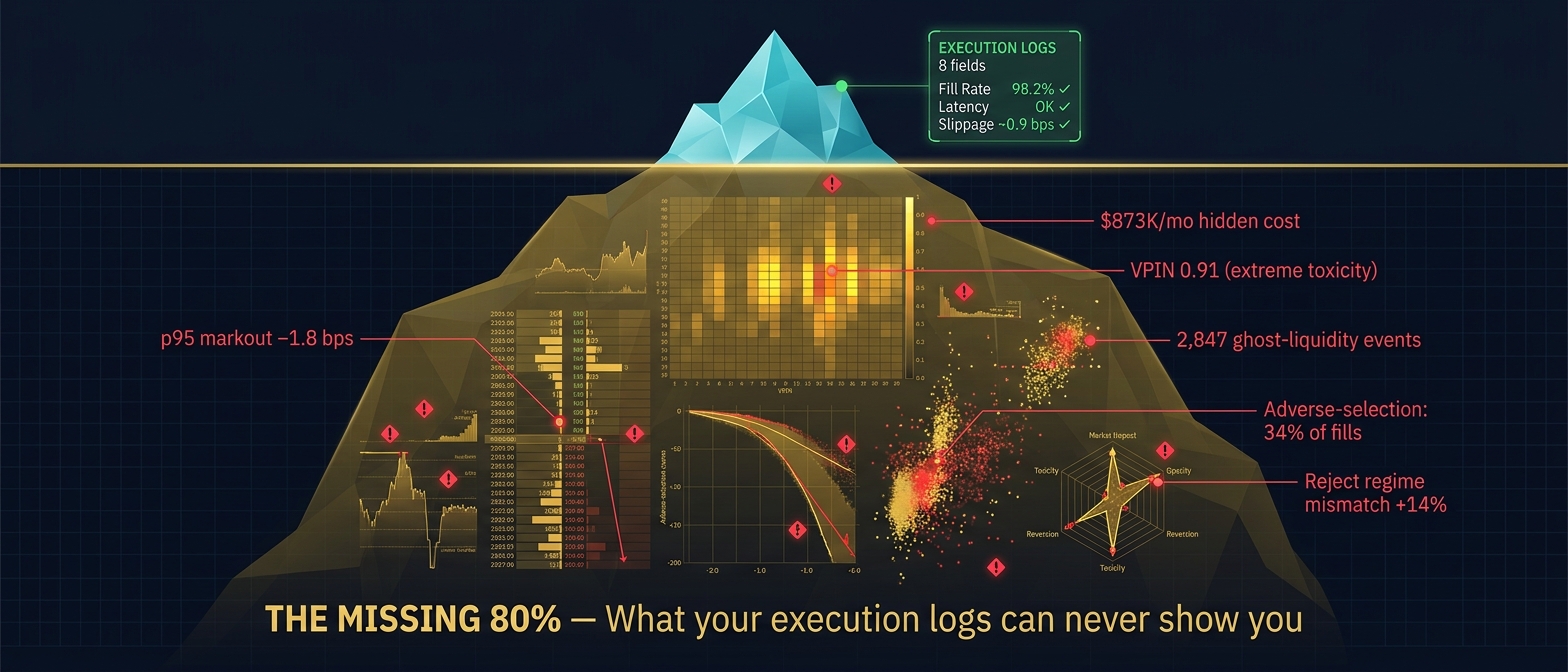
The “missing 80%” — explains why your executions performed the way they did.
Where is my slippage actually coming from?
You see aggregate slippage in your reports. We decompose it into timing cost, market impact, and sizing – so you know which lever to pull.
What was the market doing when I traded?
Toxic flow, book imbalance, liquidity depth, and resilience – captured at the exact moment each order executed. The context your execution logs can’t provide alone.
Are my orders behaving the way I think they are?
Reject spikes during volatile regimes. Cancel/replace chains that create exposure instead of reducing it. Queue positions that guarantee you’ll never get filled.
Is my speed actually earning me money?
Not all latency improvements translate into better fills. We measure where speed matters and where you’re over-investing in microseconds that don’t convert.
What’s the dollar breakdown of my execution losses?
Timeouts, partial fills, opportunity cost, fee drag – broken down so you can see exactly where dollars are leaking and what each fix is worth.
How is my venue actually performing?
Fill rates, reject patterns, reliability, slippage distribution – a complete scorecard for every venue you touch, not just the metrics your OMS shows you.
Inside the Report
Every figure below is from a real diagnostic run. No mockups, no renders – the actual artifacts your team receives.
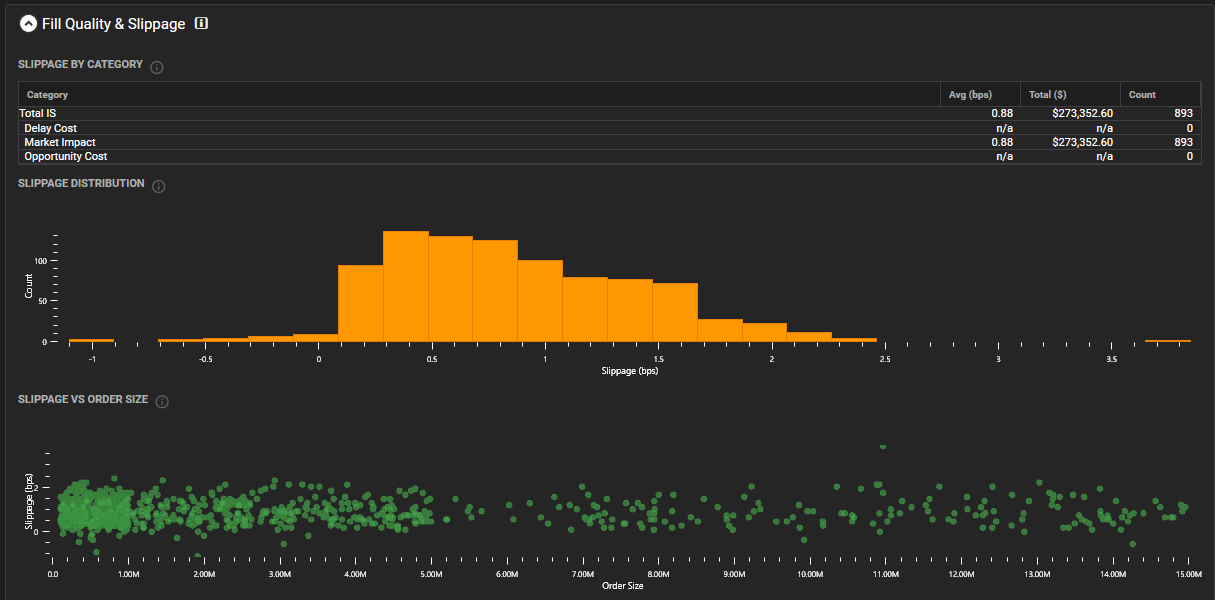
Slippage, decomposed.
Not just the average. The full distribution shape, Implementation Shortfall by component (delay cost, market impact, opportunity cost), and slippage-by-order-size scatter. This is where the real cost lives – and how you find it.
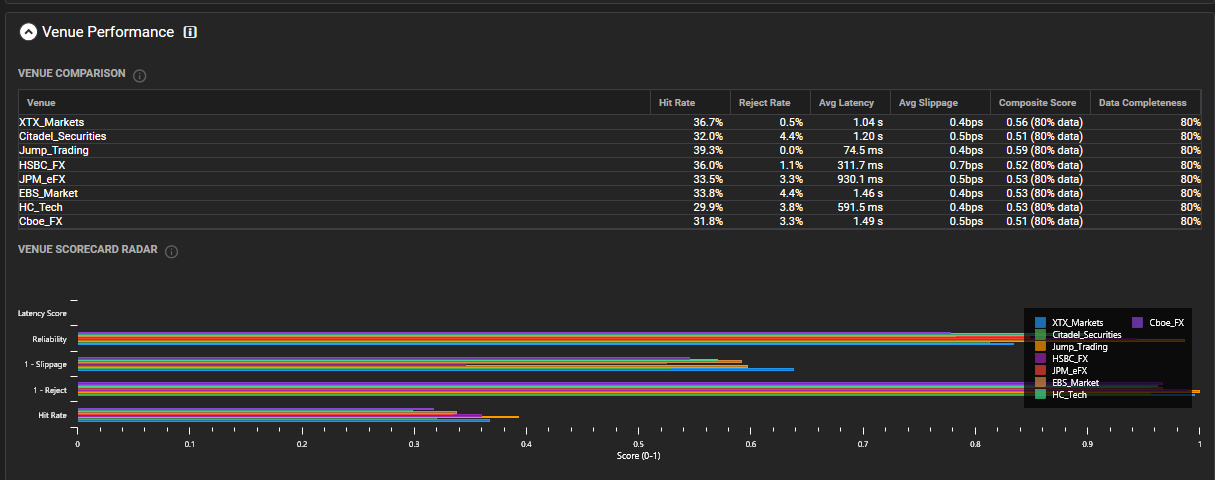
A scorecard for every venue you touch.
Per-venue hit rate, reject mix, latency, and slippage distributions in one comparison table — plus a composite radar so multi-venue comparison is visible at a glance. No more pivoting six OMS exports.
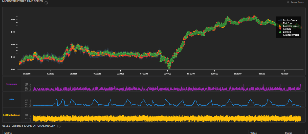
The market’s state at every execution.
Price action, bid-ask spread, and fill markers overlaid with Resilience, VPIN toxicity, and LOB Imbalance – captured at every execution milestone. The microstructure context your execution logs can’t see alone.
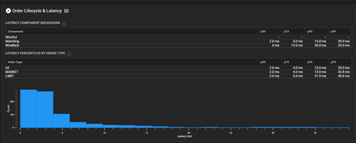
Where the latency dollars actually go.
WireOut / Matching / WireBack decomposition, percentile tables (p50, p75, p95, p99) split by Market and Limit orders, full distribution histogram. Find the microseconds that matter – and the ones that don’t.
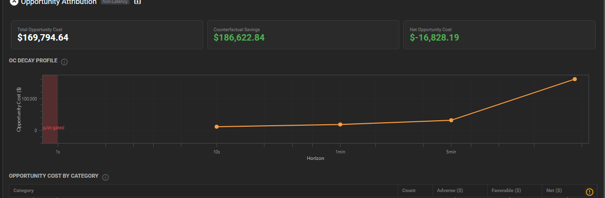
Every dollar of opportunity, categorized.
Total opportunity cost. Counterfactual savings if fills had landed at intended price. Net effect on the book. And the decay curve showing how fast that opportunity evaporates after each missed fill – so you know which seconds are expensive.
Detects What Your TCA Misses.
Ghost liquidity. Systematic rejects. Stale-quote anomalies. Each integrity flag is attributed to a venue, counted, and severity-ranked — in an auditable table your team can verify line by line.
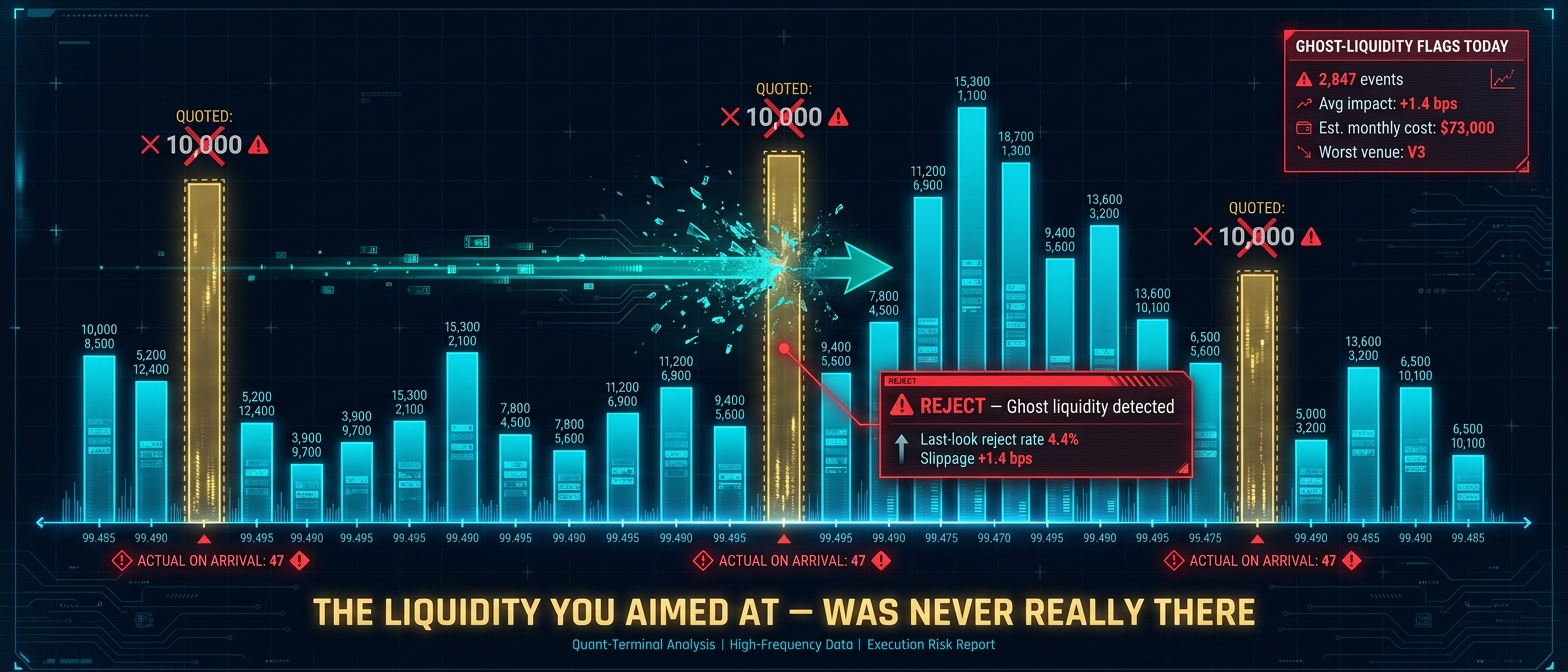
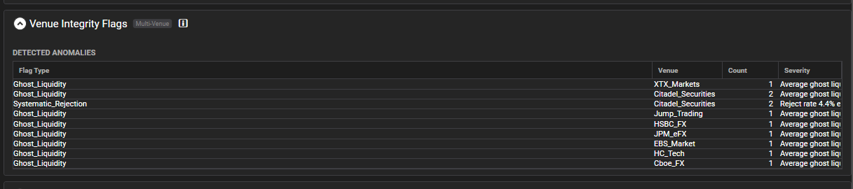
Standard TCA treats rejects as noise. We treat them as evidence.
What a Diagnostic Reveals
Real patterns the engine detects. Each example maps to an actual report section with quantified findings.
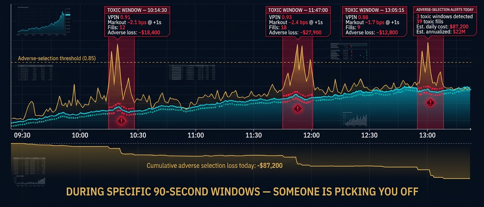
A market maker was experiencing elevated adverse selection on passive fills, but only during specific 90-second windows following order book imbalance spikes. VPIN scores exceeded 0.85 during these windows while baseline sat at 0.4. The diagnostic identified that their quoting logic wasn’t pulling fast enough when toxicity spiked. Tightening the VPIN-based pull threshold eliminated the exposure.
1.4 bps improvement on passive fills
On $20M daily notional, that’s ~$70K/year. On $200M, ~$700K/year.
An algo desk had a 4% overall reject rate, which looked acceptable. The diagnostic disaggregated by market regime and found that during high event-density periods (>5K messages/sec), the reject rate spiked to 18%. These were exactly the moments when the strategy had its highest expected edge. The root cause was a rate limiter configured too conservatively for burst conditions.
2.1 bps of missed edge recovered
On $50M daily notional, that’s ~$260K/year. On $500M, ~$2.6M/year.
A stat-arb desk was investing in co-location upgrades to reduce round-trip latency from 45 to 28 microseconds. The latency-to-fill correlation analysis showed that below 35 microseconds, additional speed had zero incremental fill improvement on 3 of their 5 instruments. They were over-investing in speed on liquid names where queue position mattered more than raw latency.
Infra budget redirected to instruments where speed converts
Savings depend on current co-location spend. Typical reallocation: 20-40% of annual infra budget.
An execution desk was experiencing 3.2 bps average slippage on parent orders above $50K notional. The Implementation Shortfall decomposition revealed that 55% of the cost was timing slippage (delay between signal and first child order), not market impact. The signal-to-order pipeline had a 12-microsecond overhead from an unnecessary risk check that ran synchronously. Removing the bottleneck cut timing cost by 1.8 bps.
1.8 bps reduction in timing slippage
On $100M daily notional, that’s ~$450K/year. On $1B, ~$4.5M/year.
All examples from internal analysis using synthetic data. Impact scales with your trading volume. Each diagnostic engagement produces dozens of findings across 25+ analyses.
See what your execution logs are hiding.
We’re onboarding a handful of firms through a free pilot program. Tell us about your operation and your data. We’ll review and reach out if there’s a fit.
No commitment. No sales pitch. Just a technical conversation about your data.
FAQ
At minimum: execution or order logs in FIX, JSON, or CSV. For the full diagnostic, we also need historical market data (L1/L2/L3) and public trades for the same period. We’ll confirm on the discovery call.
Signed NDA + Data Handling Agreement. Isolated encrypted workstation, accessed only by our lead consultant. Permanently deleted within 5 business days of delivery. No cloud, no third-party access.
3-5 business days from kickoff to report delivery.
Our lead consultant has 20+ years building production HFT systems. The proprietary engine was built from that experience. You work directly with a senior practitioner on both calls, not a junior analyst or a sales team.
You get the full execution-side analysis: order lifecycle, fill quality, slippage decomposition, venue performance, and the Top-3 Changes Memo with quantified dollar impact. That alone delivers actionable findings. Adding historical market data unlocks the microstructure context layer: VPIN toxicity, LOB imbalance, market resilience, spread dynamics, and cross-venue comparison. That’s the “missing 80%” that explains why your executions performed the way they did.
TCA is a report card. This is a playbook. 25+ simultaneous analyses through a proprietary engine, interpreted by someone who has built these systems. Standard TCA gives you neither the engine depth nor the expert context.
No. Every metric, decomposition, and finding is computed by proprietary analytical tools built over years of R&D on production trading systems. These are purpose-built engines, not LLM prompts or AI-generated summaries. We use AI openly in our daily workflow like any modern team, but the core analysis – the numbers, the decompositions, the microstructure measurements – comes from deterministic, auditable code written by engineers who have built and operated these systems. That’s the difference between a report you can act on and one you have to second-guess.
We’re currently in an early access phase, onboarding a handful of firms through a free pilot program to validate the service and refine the experience. Pricing will be finalized based on what we learn from these initial engagements. If you’re interested, apply for a pilot slot and we’ll discuss scope and terms directly.